WhatsApp, the popular messaging app, is gearing up for some exciting design improvements and visual refreshes to enhance its user experience. Recent reports reveal that the messaging platform is working on revamping the bottom navigation bar, the Context Menu, and now even the Action Button for Android. Let’s dive into the details.
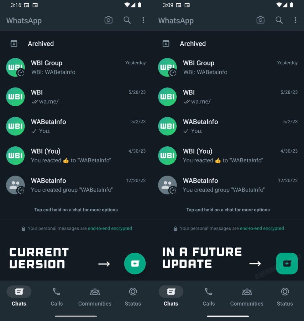
According to a report from WABetaInfo, the messaging giant, now owned by Meta, is planning to give the floating Action Button a whole new look with Material You theming support. The Action Button, situated at the bottom right corner of the app, allows users to start a new chat instantly. This redesign is expected to be part of the upcoming WhatsApp Beta for Android version 2.23.12.15.

The accompanying screenshot showcases a side-by-side comparison between the current version and the proposed change to the Action Button. The future update will transform the circular icon into a rounded square icon, often referred to as a “squircle.” Additionally, the icon will align with Android’s Material Design 3 guidelines, giving it a fresh and modern appearance.
It’s important to note that this design overhaul won’t be limited to just the floating Action Button. The buttons within the call and status bar are also anticipated to follow the same theming principle. WhatsApp has also been testing a Material You-based toggle, which Android users have eagerly awaited. With these user interface and user experience improvements, it seems like Meta is actively listening to its user base.
Currently, this feature is still in development and not available for beta testers. However, we can expect some lucky beta users to get a taste of this new design implementation soon. In the coming weeks, a wider beta rollout may take place, but the public availability of this design overhaul is yet to be confirmed.
Rest assured, we’ll keep you updated on any further developments as they unfold. So, stay tuned, and feel free to share your thoughts on the redesigned Action Button for Android in the comments section below.